
Visual Development
Bambi Environment Study #1

Notes for studies
When doing a study, you first need to determine what your intent is in doing it. Are you doing a color study? painting study? character emulation? design examination? composition? overall technique?
This is helpful for you to think about because it will determine what you will do going forward. For me I will be doing a painting study where I try to achieve the same look as the original painting just through a digital lens. Now because I’m interested in painting. I will be starting with a simple blocking trace. Essentially, I will be tracing with a pencil brush the general placement of the larger pieces.
So, I will be tracing the hill and valley separation, foreground & background tree placement (Essentially, I will be getting what the layout department would have gotten see example below). This is because I don’t want my brain to be thinking about comparison measurements I just want to focus on:
Color
Texture
Effects
So essential I’m letting my brain have a break in some things in order to really focus on others.
One last thing before I discuss my takeaways from this study.
Take your time when doing a study.
This shouldn’t be timed.
You don’t have to finish it in a day or a week.
Speed comes with practice.
If you get frustrated while doing your study do the following.
Walk away and work on something else. This time away will allow your brain to work on it and you’ll be surprised at how much better you will do after a break.
Realize that this is something new. New is hard. Practice will make it easier.
Don’t feel bad if it is slightly off from the original piece.
These artists were trained differently. And their experiences and training influenced their pieces.
They also had Art Directors making changes or corrections on the work until it was to the studios liking.
You are your own art director, and studio. If you are happy with the result, then it’s finished, and the process was a success.
Make sure to step away from the piece and look at it from farther away. And flip the camera every now and again to gain a fresh perspective.
Brushes & Textures
Watercolor brushes
Clip Studio:
Content ID: 1682349
Specifically Matt’s ADD Texture A (This was the main brush I used and it was awesome)
Airbrush
Clip Studio:
Soft Airbrush
Running Color Spray
Ink Brush
Clip Studio:
Content ID: 2077196
Erasers
Clip Studio's Kneaded Eraser
Kyles Dry Media - Rough Eraser 2
Blending Brushes
Kyle's Dry Media - Basic Smudge
Kyle's Dry Media - Rough Smudge Fun
Clip studios Blur Brush
Effects & Textures
Film dust textures
Paper texture - For non multiplane camera parts
Clip Studio
Manga Paper (Set to Linear Burn)
Content Idea: 1888239
Film Grain
Clip Studio
5 Types of RGB Color Noise Patterns
Content Idea: 1952681
Takeaways
These are some of the takeaways from what I learned in my study.
Lost and soft edges are very important for this dreamlike style.
Impressionistic interpretations are important.
Distinct layers in composition are also important.
Build up colors. Don’t just through down large blocks of color as you would digitally but do it in a more traditional approach. This is time consuming and a little annoying, but the look is better and more akin to the time period.
For laying down the initial color I painted on one layer. Then built up the details on another layer. Finally for the oil painted parts they got their own layer. I tried to use the minimal number of layers as I could. This was the best way I found to blend the paint together in a realistic way. In the end I had - layers
Images
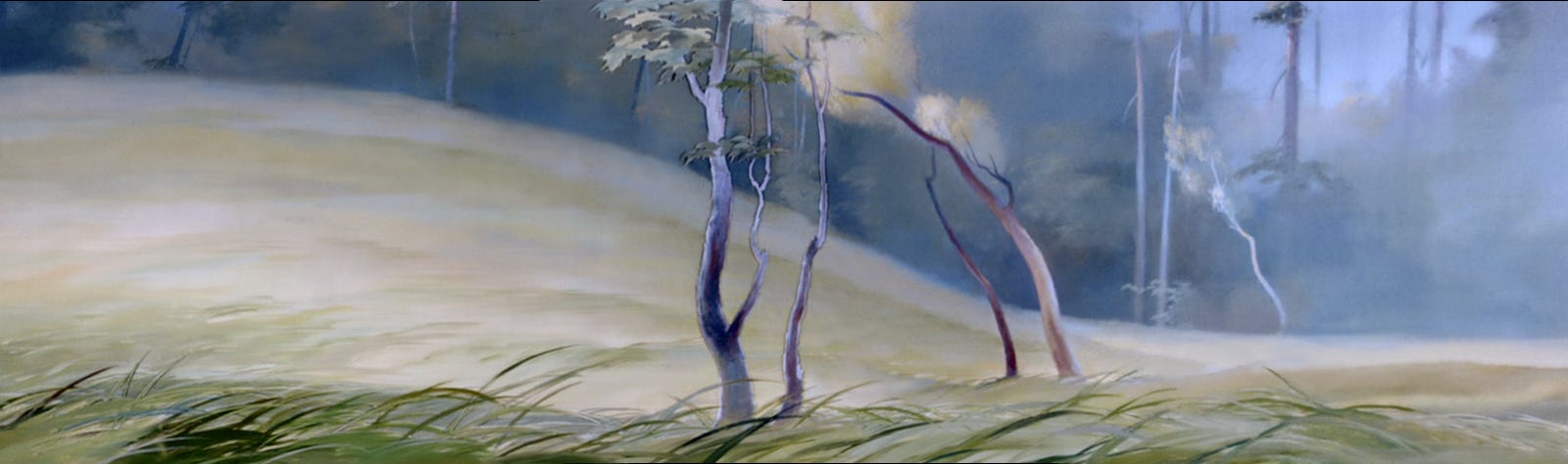
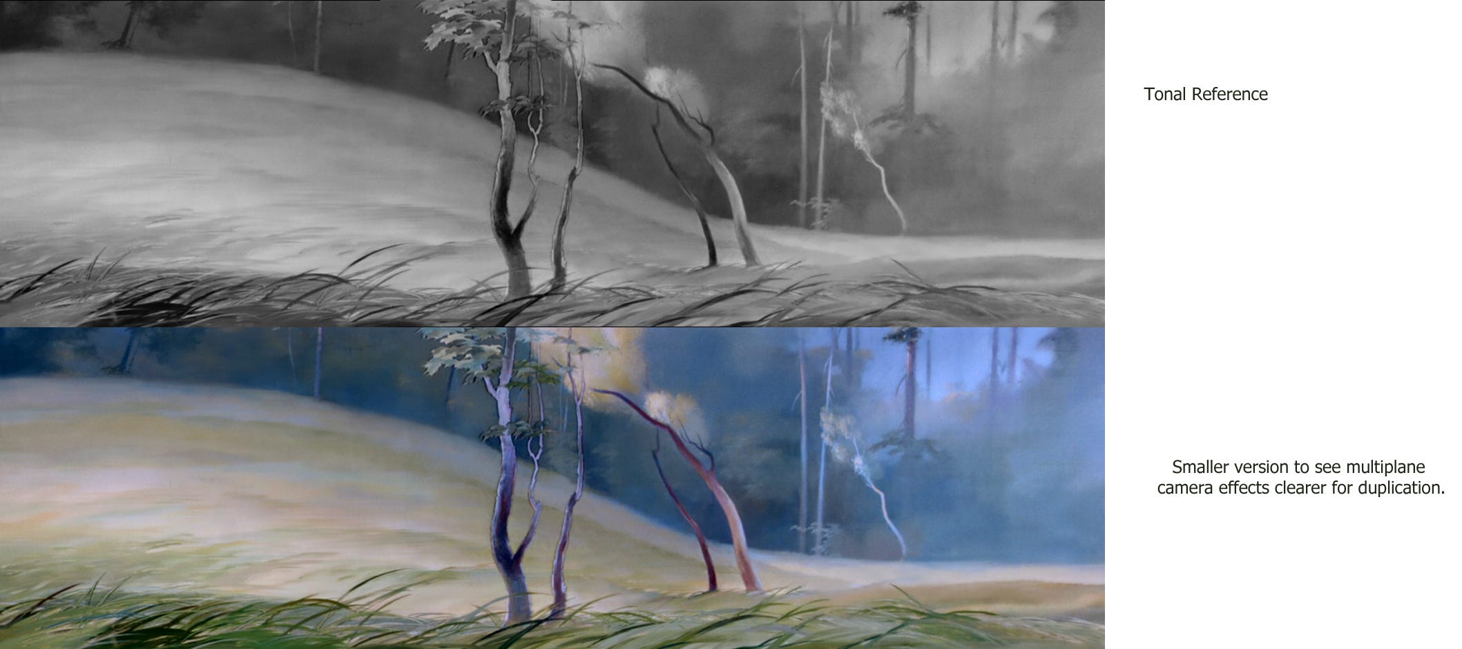
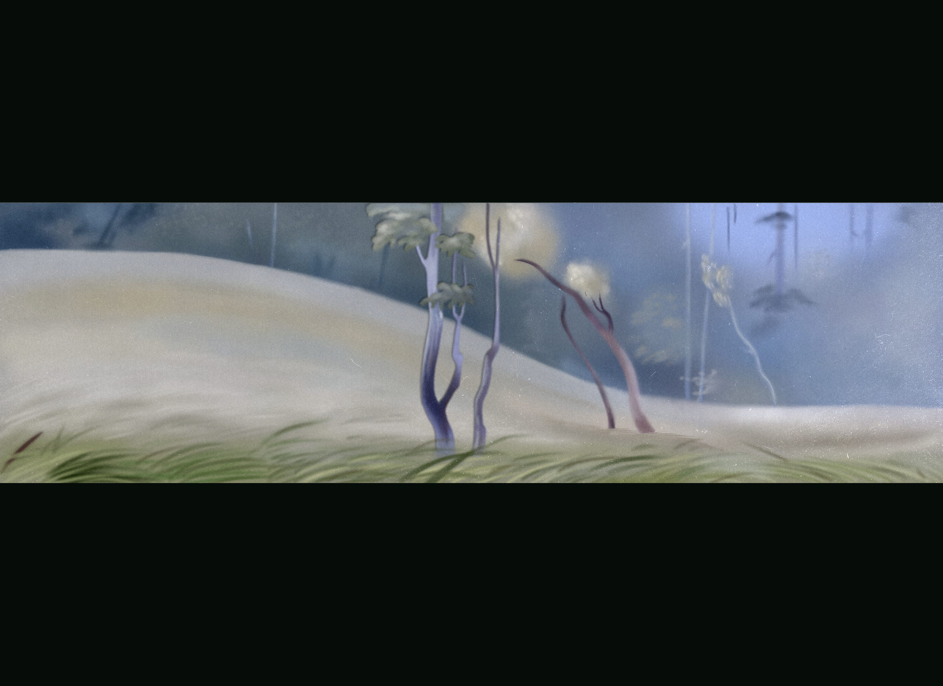
This is the image I will be duplicating. It’s from the meadow scene in Bambi. Note the multiplane camera grass and foreground tree. This will indicate to me that I need to be thicker in my application of “paint” while working to produce an oil painted feel.
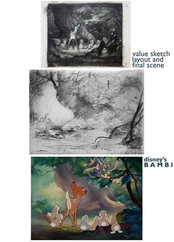
This shows the process of background creation of the movie Bambi.
The first image is a value sketch that would have been used as tonal reference for the background painter to indicate in color.
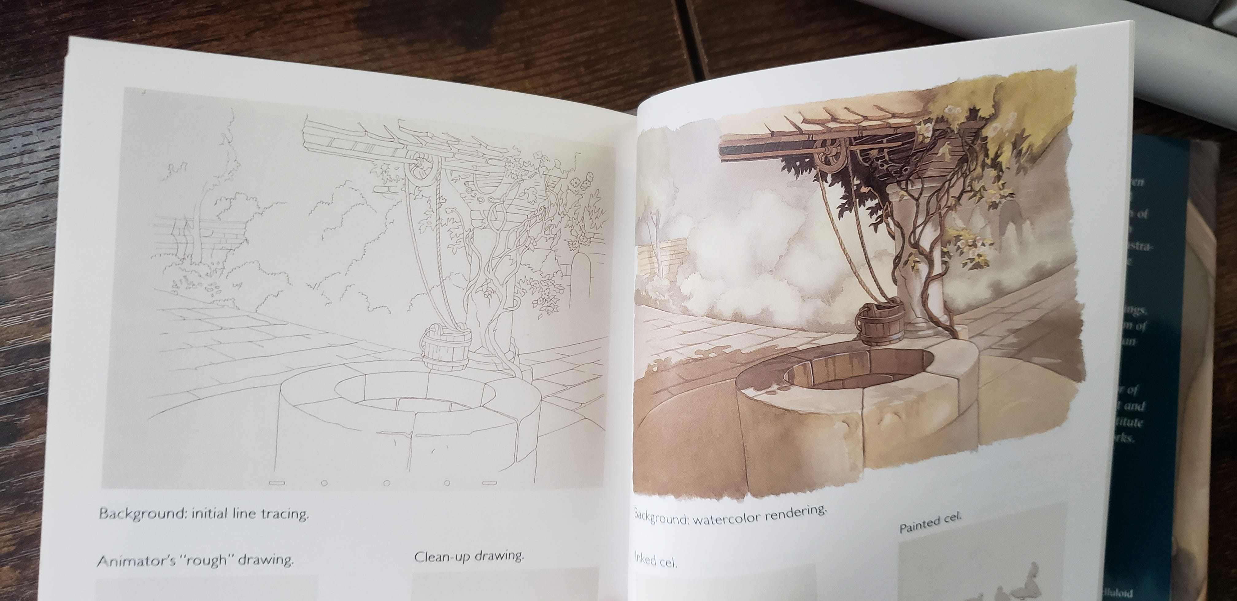
The next is a rough layout which would have been cleanly traced onto watercolor paper or transferred onto glass for the multiplane camera. (To show that they would trace a cleaned up version of the rough layout I’ve also given you an example from Snow White which was being done around the same time as reference.)
And last is the finished watercolor painting with foreground right multiplane trees.
My Version
Time lapse
Next Time
In the next post I will be doing a second background study from the movie Bambi.
***
Please remember to like, share, and subscribe to never miss a post. This helps me to grow and reach more people!