
Visual Development
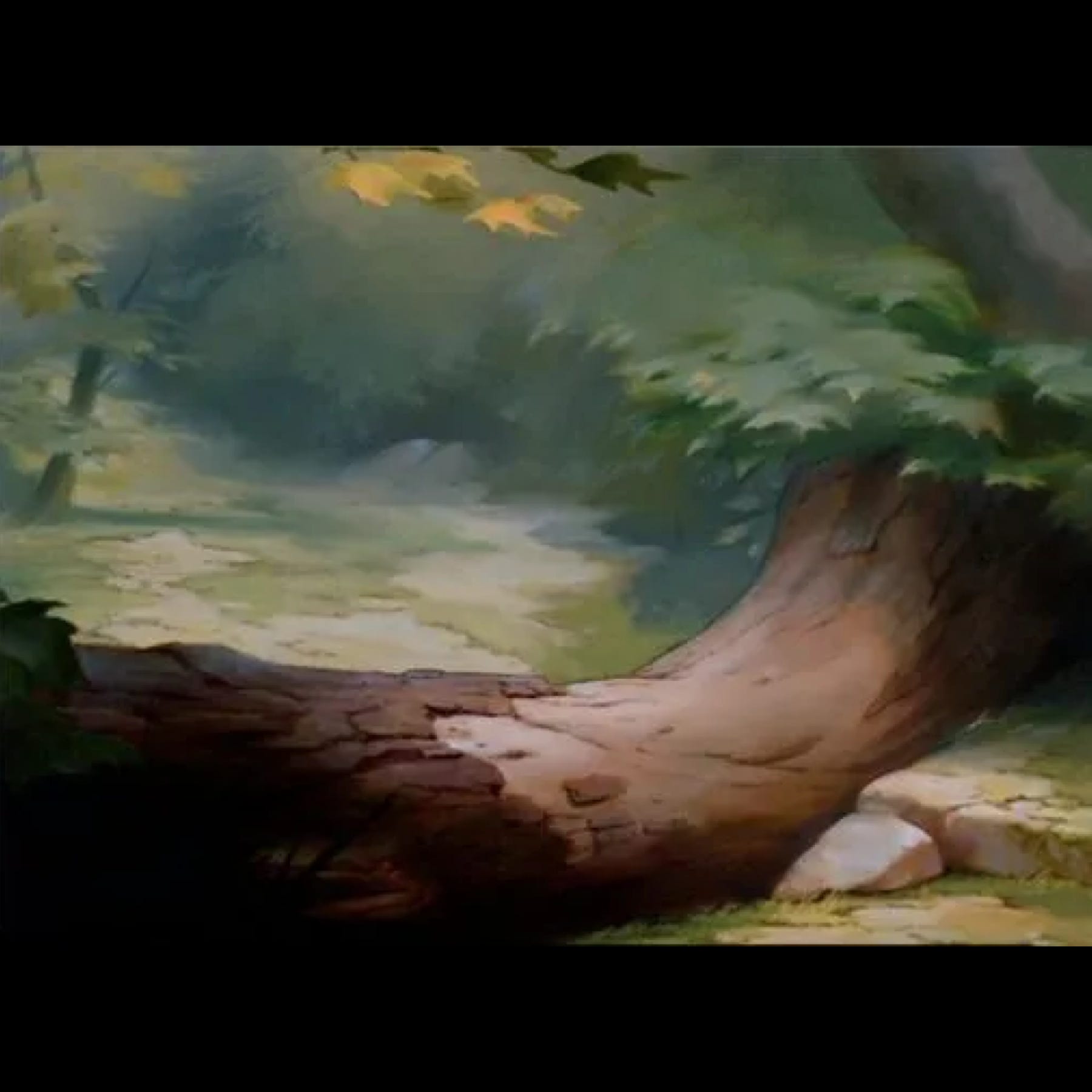
Bambi Environment Study #4

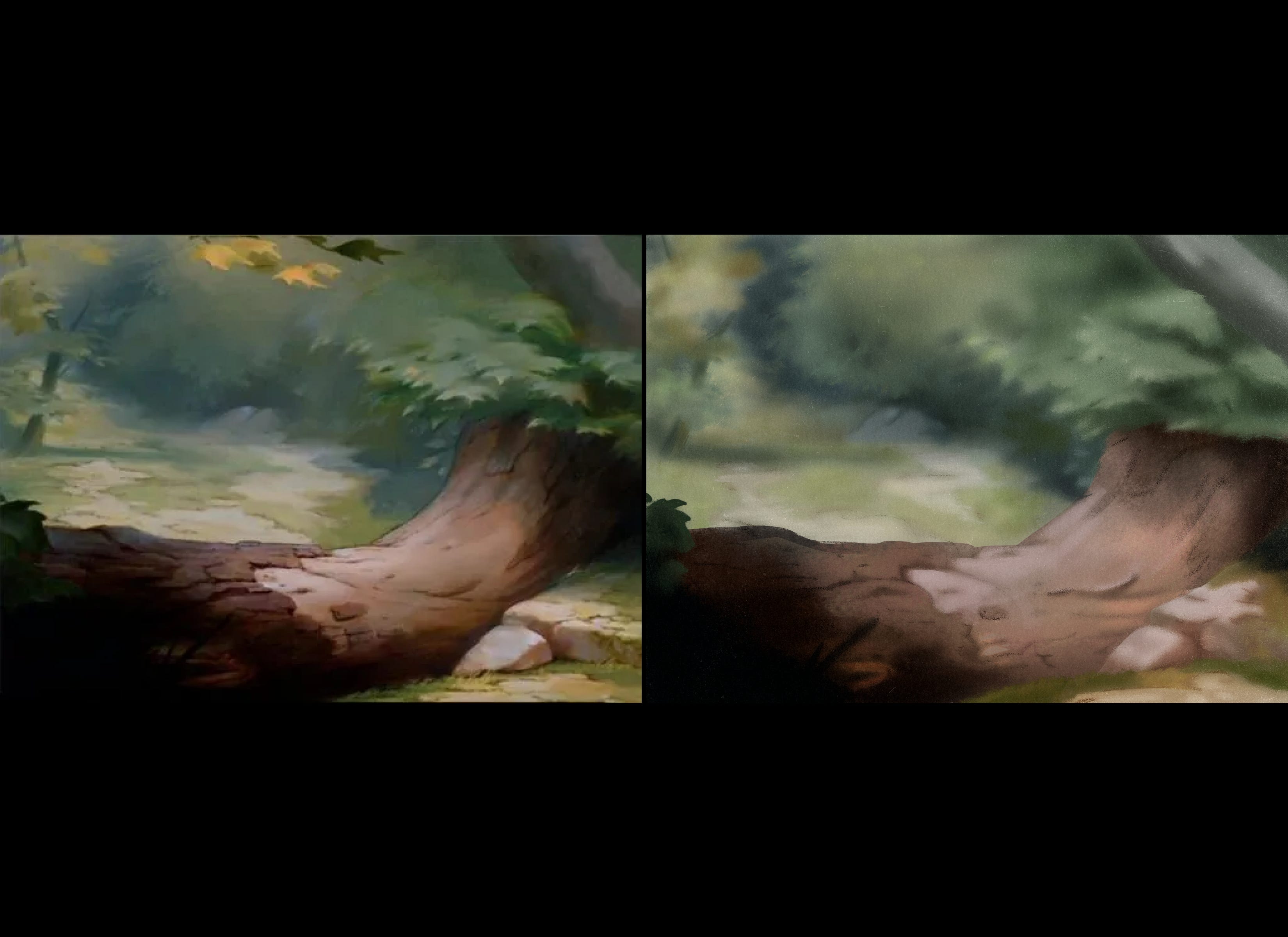
As with the last three studies I started by first marking out a selection to add a “paper” section to do the initial tracing on top of. This piece was far more detailed than the last three. But I tried not to trace too much of it and pull more from my own imagination. I just selected the largest bits for overall proper placement.
Lastly, in this painting I tried to use more impressionist based brushes as an experiment to lay down multiple colors at once and to build up forms a little bit faster (as impressionists were known to do). And I actually liked it. It ended up not looking as close to the original, but I think it gave it a liveliness that I enjoyed.
I then continued the same process that I did in videos 1-3 taking my time and really trying to nail down the forms as I saw them. Some of the takeaways from this study can be seen below.
Takeaways
With these more complex images noting where the action will be key to determining how much detail you will add to the scene. This is important whether you’re dealing with a singular illustration, animation or comics. You don’t want to clutter the image when doing impressionist work. It is all about an “impression” of what is observed in the moment. Which undoubtedly is tricky if you (like me) were trained in realism.
Try to keep your image pulled back especially in the initial blocking in phase. This will help you see major forms and help you to keep the “impressions” of the objects in mind and not the detail.
After blocking in the basic shapes, you should build up the forms slowly starting from the background and work your way into the foreground.
One thing I realized in making this piece was that unsaturated colors from the original had a hard time translating into a digital format. As you can see I color picked when I found that my eyes were not perceiving the color correctly and as I built up the colors and tried to stay in that block of color, I began to lose the forms I was trying to create. Everything became muddy. But when I exaggerated the colors slightly, I found that the forms were able to be seen. So, I had to make a choice. Do you want similarity and loose forms? or do you want forms and lose similarity? In the end I chose the form, and I sacrificed the more washed-out colors in favor of a slightly exaggerated color. This is something that I found I had to do with the last three as well but not to the same extent. In the end what do you think was a good decision let me know below in the comments?
I had a little trouble with using Kyle’s Impressionist brushes for the more intricate parts like leaves. I ended up using Kyle’s Paintbox - Gouache A Go Go Tilt to keep the texture and paint mixing but fill in the smaller details.
Reference Images
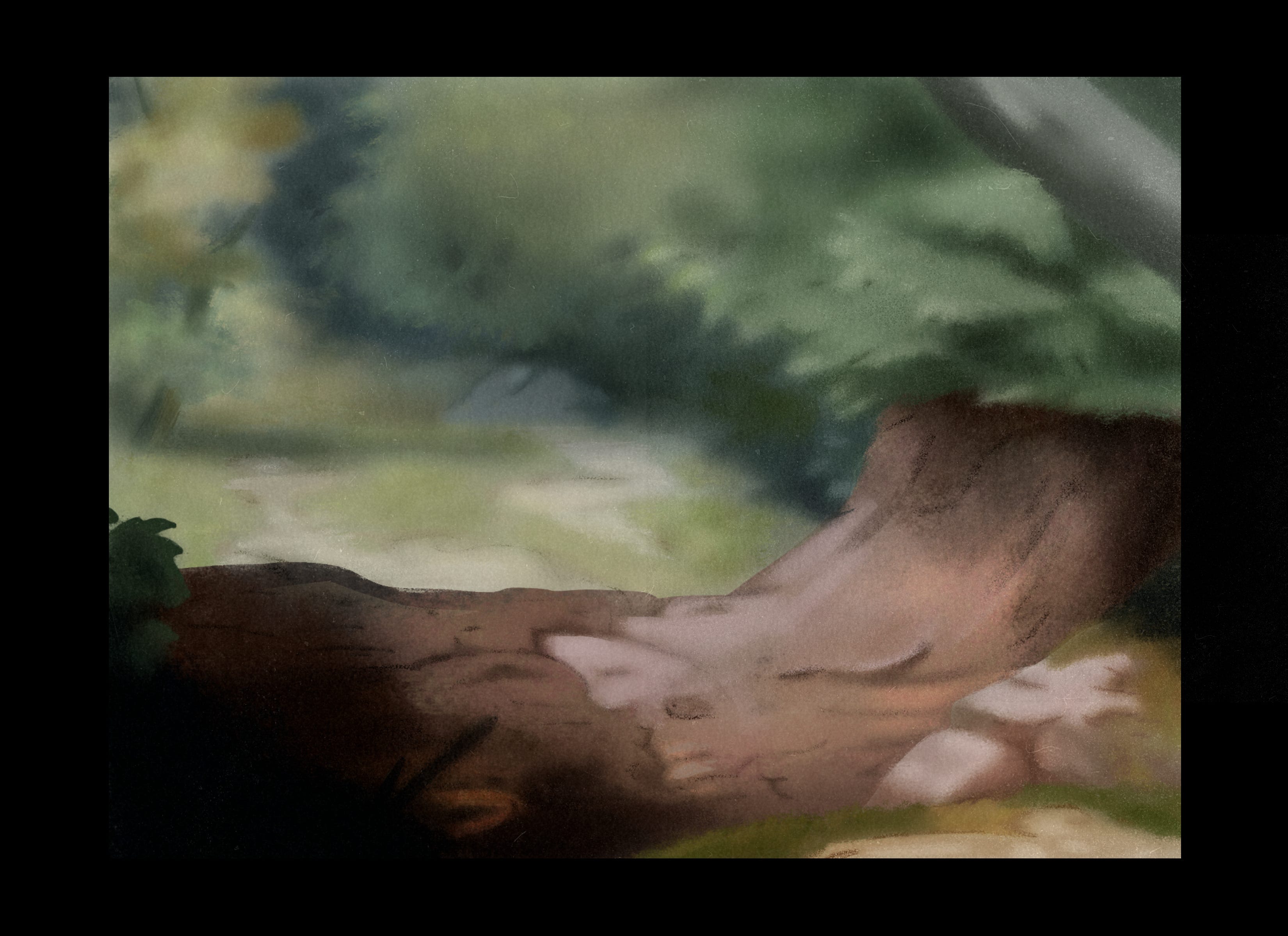
My Version
Time lapse
Next Time
In the next post I will be working on my 7-page comic “Teacup” by redesigning my first character “Orlando” to fit with my new design aesthetic.
***
Please remember to like, share, and subscribe to never miss a post. This helps me to grow and reach more people!